Noktegram
Optimized book summary & micro-learning web app with real-time filtering
Noktegram is a dynamic learning platform that uses bespoke frontend architecture and lag-free filtering to pave the way to world-class knowledge for today's busy audience.
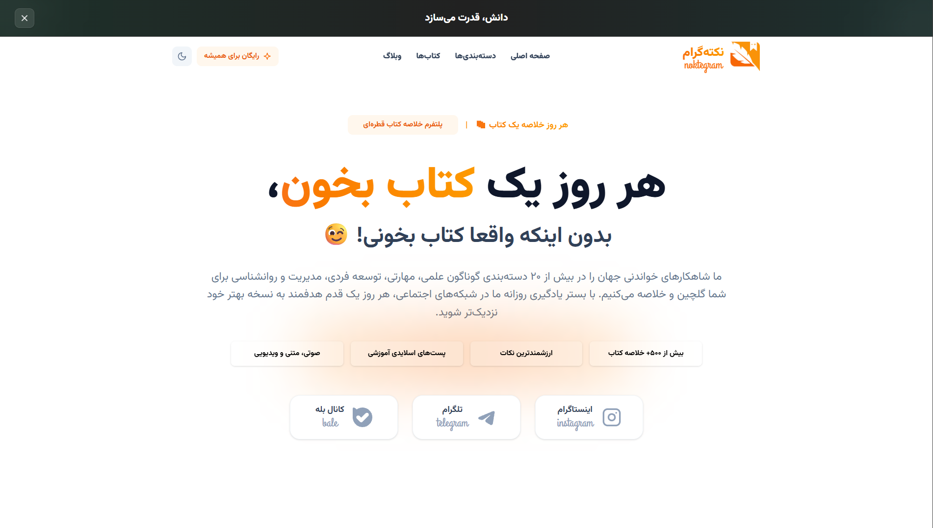
Project Overview
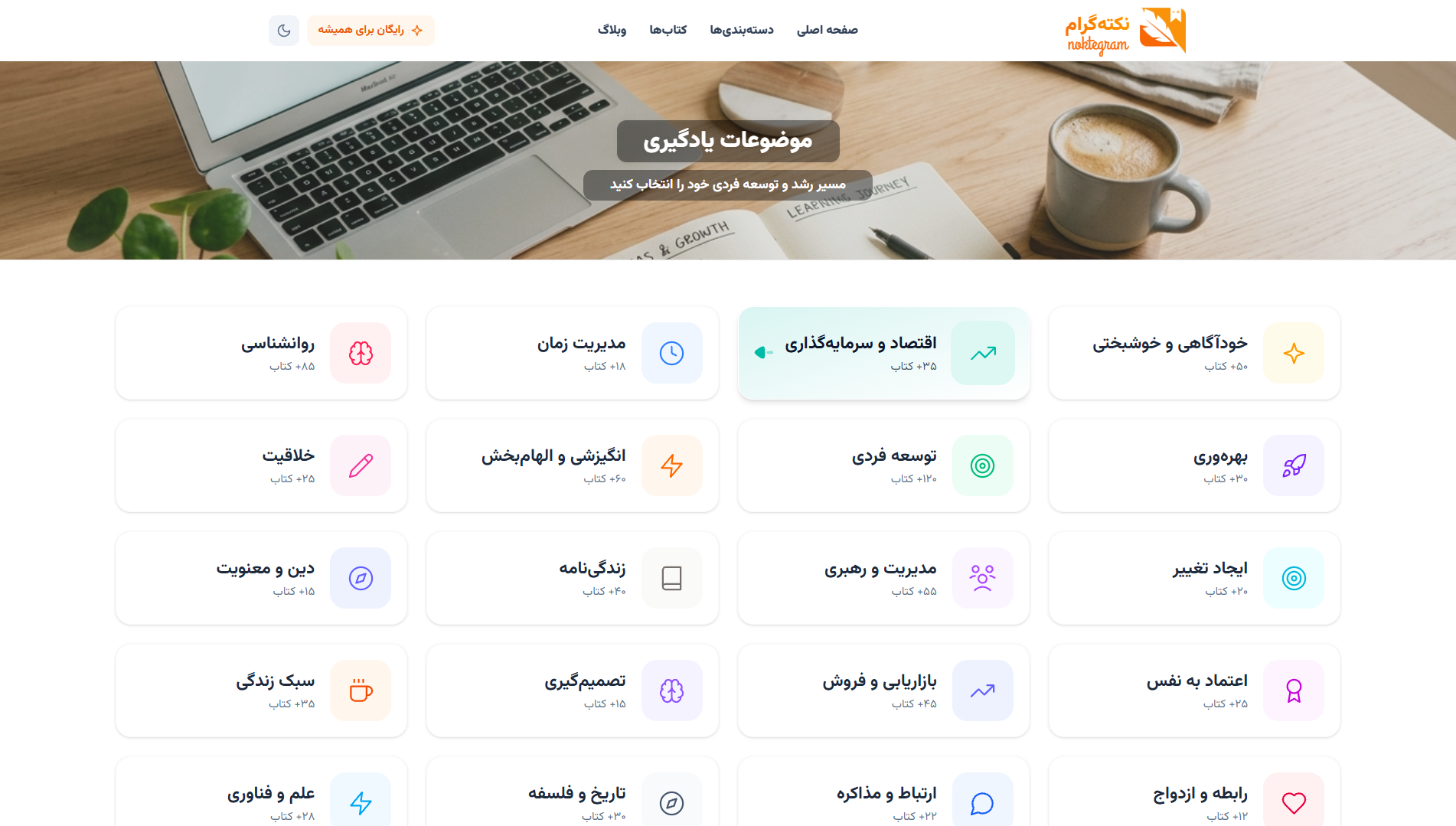
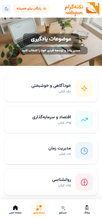
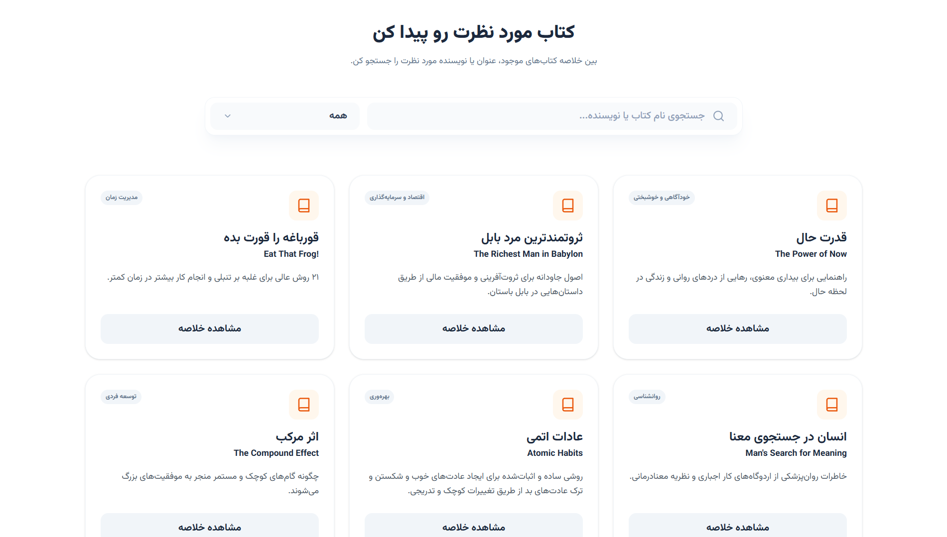
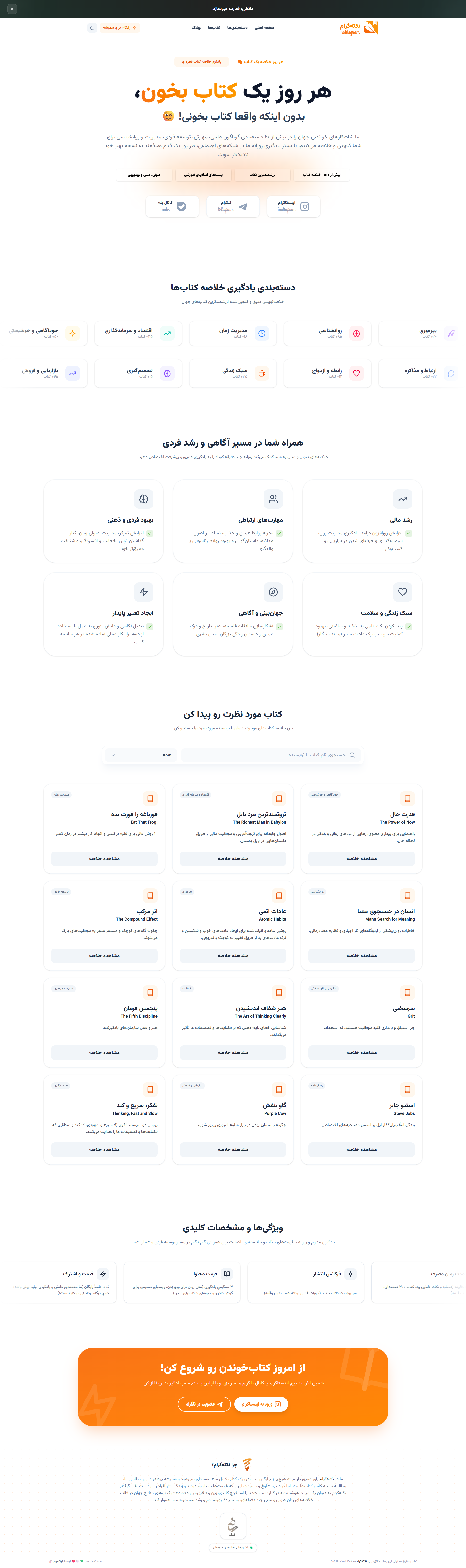
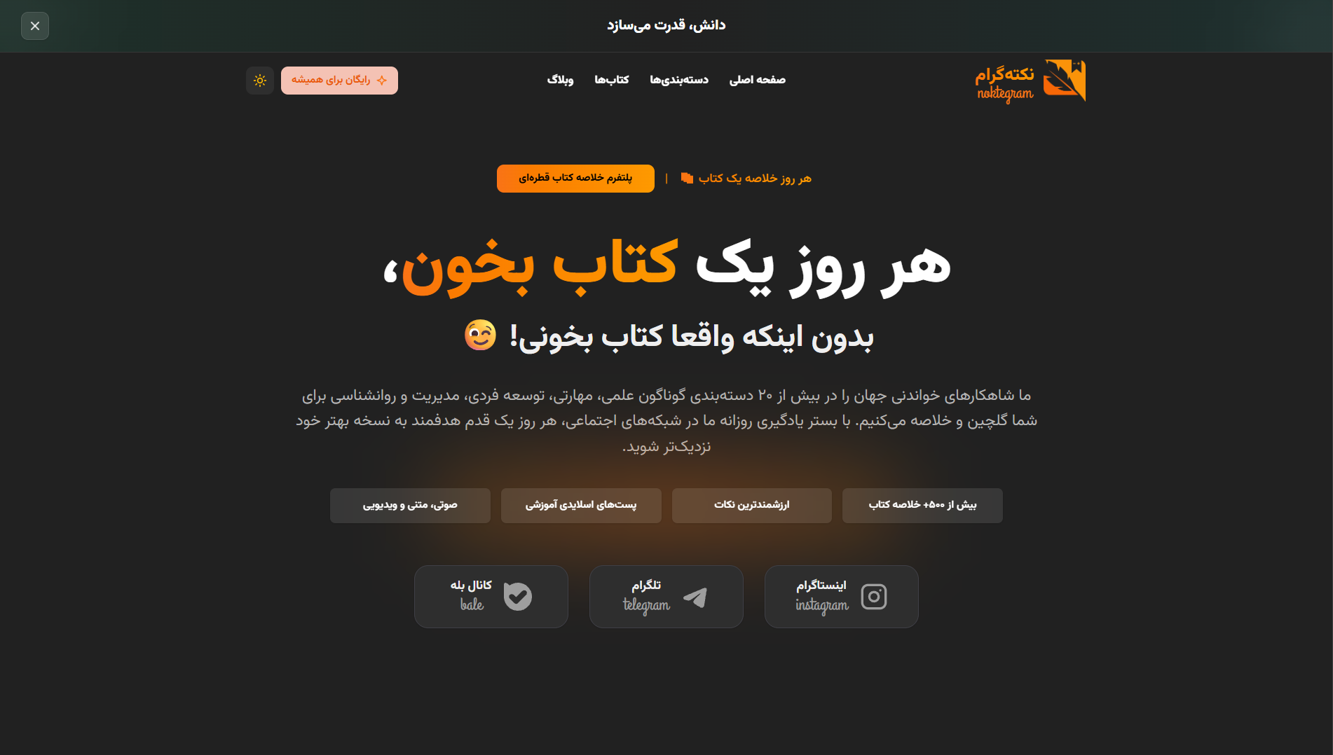
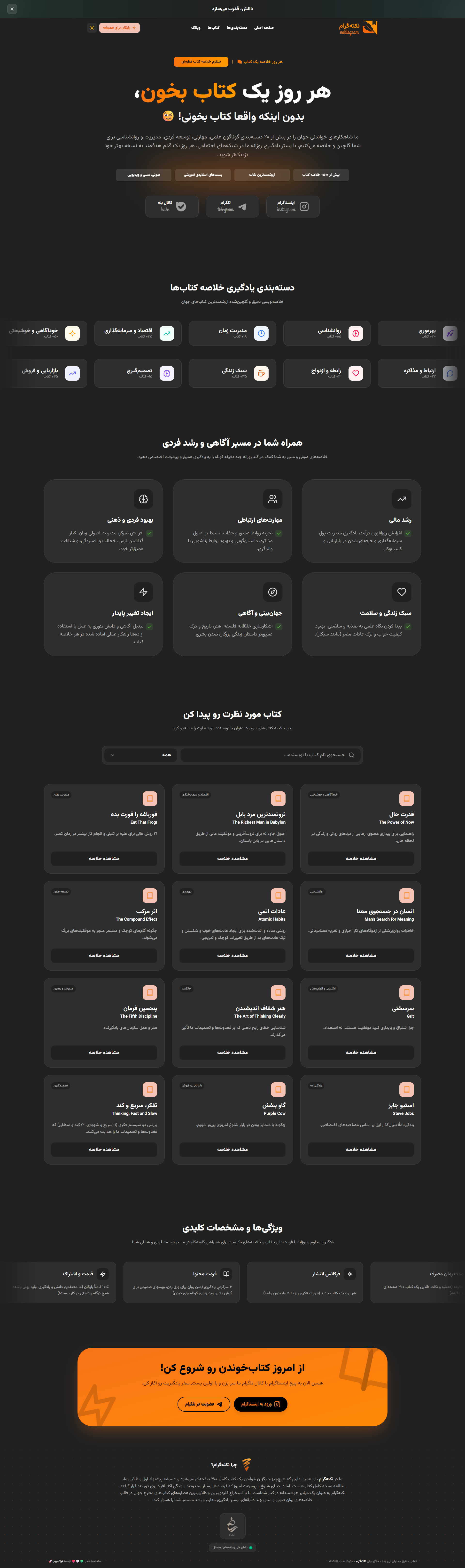
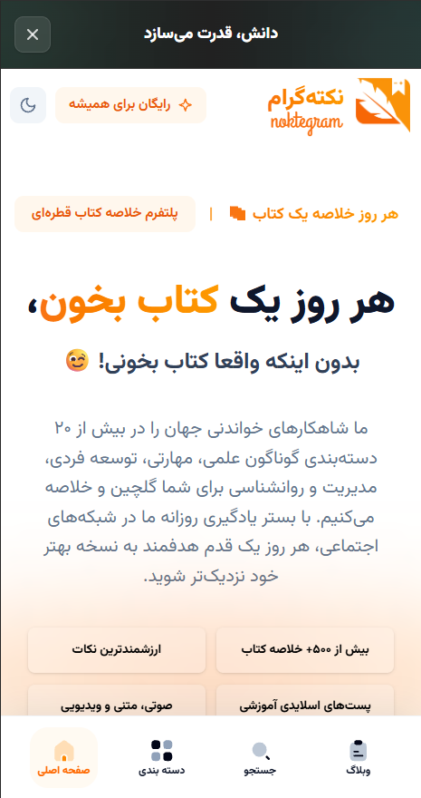
In today's fast-paced era, lack of time is the biggest challenge for reading culture promoters. The 'Noktegram' project was born with the idea of summarizing the world's most fascinating and impactful books. Development's main challenge was creating a highly modern and efficient structure where users could find their desired book, change categories, and read rich content in minimum possible time and clicks. We strongly focused on 'unrivaled initial loading speed', 'smooth mobile navigation (Swiping and Snapping Behavior)', and 'eliminating extra visual clutter (Minimalist UI)'. All pages, card transition animations, and search boxes are connected in real-time, optimizing user gestures for a focused reading experience.
Throughout the development process, we focused heavily on User Experience (UX). All elements are designed to help the user achieve their goal in the shortest possible time. Furthermore, the admin panel allows managers to receive detailed reports on user behavior and sales performance.
Project Images

Services Provided
- User-centered research, audience personas, and UI/UX engineering
- Rapid bespoke frontend implementation with web animations
- Interactive design and layout optimization across mobile and tablet devices
- Technical SEO consultancy and initial load speed optimization
Results & Achievements
- Improved website Bounce Rate via sub-second loading for summaries.
- Increased user interactive engagement on mobile through fluid gesture optimizations.
- Established a robust visual identity and maximized social media traction through precise design-brand alignment.
Key Specifications
- Sub-second Search & Real-Time Filtering: Instant content querying and filtering without page reloads, offering response times under 50ms.
- Mobile-First Touch Snapping: Fluid touch scrolling and snapping layout optimized for mobile screens, smoothly transforming into a 4-column grid on desktop.
- Smart Interactive Navigation: Automatic dismissal of popups and dropdowns upon clicking outside elements to ensure seamless user flow.
- Smooth Micro-Interactions: Custom browser scrollbar styling coupled with silky transitions when switching book categories.
- Typography-First Minimalist Layout: Clean card designs with soft shadows and zero visual clutter to maximize readability and reader focus.